A very different interpretation of the Keeling curve carbon dioxide data
A very different interpretation of the Keeling curve carbon dioxide data

Summary
If the interpretation of the data presented in this article is correct, then the narrative of the incessant rise in carbon dioxide is about to implode.
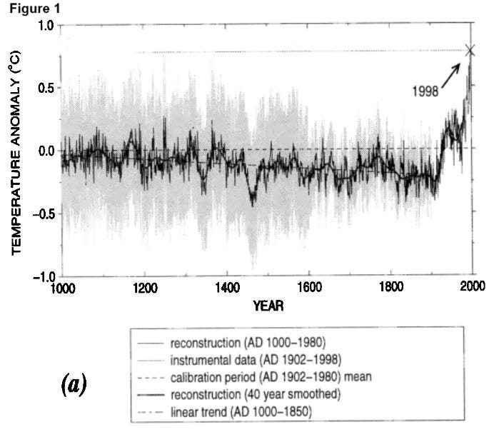
There are two graphs that are the cornerstones of the accepted climate change narrative. One is the Michael Mann hockey stick and the second is the Keeling curve named after the late Charles David Keeling. As can be seen from these two graphs below the Mann graph (Fig 1) demonstrates the increase in temperature that correlates with the rapid rise in carbon dioxide (CO2) shown by the Keeling curve (Fig 2).
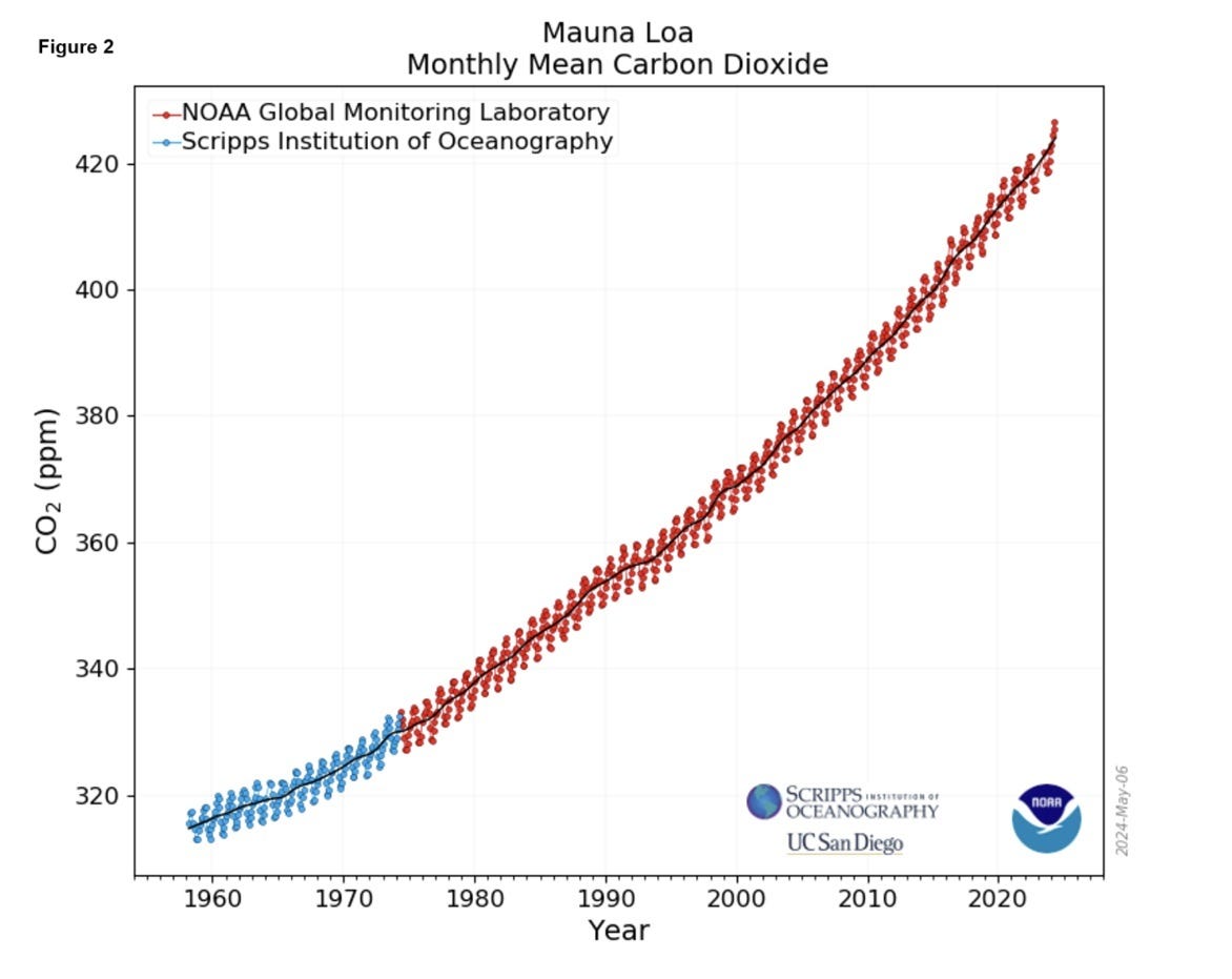
The Keeling curve only depicts the accurate measurement of CO2 from 1958 to current at Mauna Loa (Hawaii) however it is more than often linked to CO2 levels determined from ice core data shown below (Fig 3, source - Keeling web site):
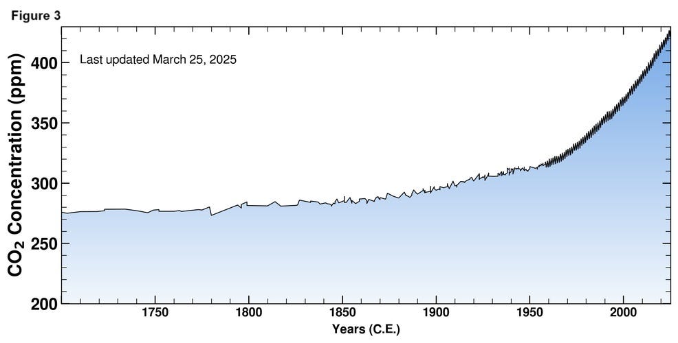
There is substantial evidence (1) that the linking of these two data sets is an invalid leap and like the Mann Hockey stick demonstrates unscientific cherry picking of data. In a nutshell the determination of CO2, prior to accurate measurements using ice cores, substantially underestimate’s the actual level.
It is widely accepted that the oceans absorb vast quantities of from natural sources and the burning of fossil fuels and that this is temperature dependent, but to what extent? National Oceanic Atmospheric Administration (NOAA) state that it is around 30%. NOAA also estimates that the oceans absorb 91% of solar energy. What if it the absorption and release of CO2 by the oceans is substantially greater?
Is there any evidence that the level of CO2 in the atmosphere is primarily controlled by ocean temperatures? Let’s take a more detailed look at the Mauna Loa data and see if there is any evidence of a solar signal. I previously established that sea surface temperature (SST) demonstrates a strong 11-year solar cycle signal (2) and that this aligns with the cosmic ray hypothesis of Henrik Svensmark and Nir Shaviv (3). The statistical technique that I used to demonstrate that solar signal used a 5 year rolling average of a 1 year standard deviation. The basis of why this method has been selected relates directly to the cosmic ray theory and an explanation is provided in the following link (4). If there is a strong controlling relationship between sea surface temperature (SST) and carbon dioxide levels, then using this method, we should be able to see the 11year solar signal in the Mauna Loa carbon dioxide data. Here is a plot of the entire Mauna Loa monthly dataset using the method described above (Fig 4):
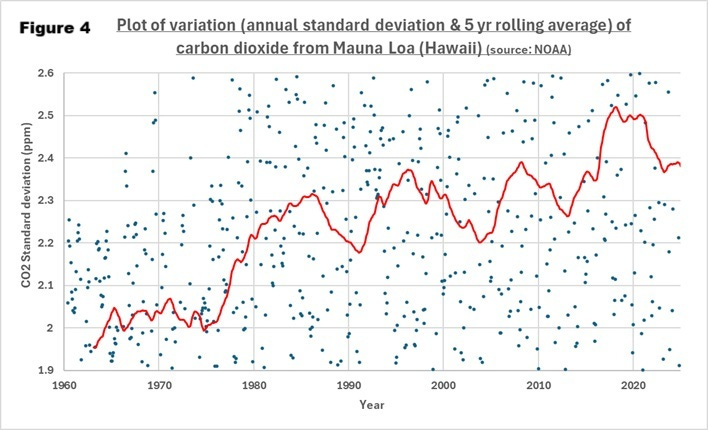
Whilst this is a limited data set in terms of period, there is clear evidence of cycling. An analysis of the peaks and dips (red trend line) above gives 11.7 and 11.9 years respectively. This cycling aligns with the 11-year solar cycle signal that is evident in the Atlantic Multidecadal Oscillation (AMO), SST and the Greenland temperature anomaly datasets.
This strong solar cycle signal in the Mauna Loa dataset indicates that sea surface temperature is a significant factor in controlling atmospheric carbon dioxide.
Using the variation method outlined above we can also compare global SST with carbon dioxide in an identical manner. This generates the following graph (Fig 5):
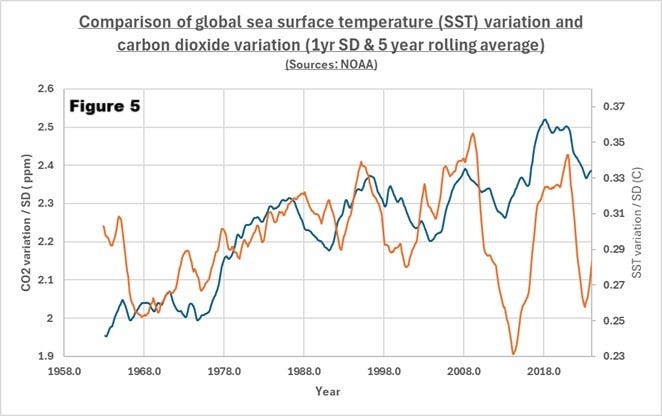
There is a strong temporal and pattern alignment between these two independent datasets again indicating a strong alignment between SST and atmospheric CO2.
Another method we can use to assess whether there is correlation between SST and CO2 levels is to examine the rate of change of both sets of data and examine to what degree they align. Here is a plot of the Mauna Loa CO2 data and aligning it with global SST on the secondary vertical axis (Fig 6):
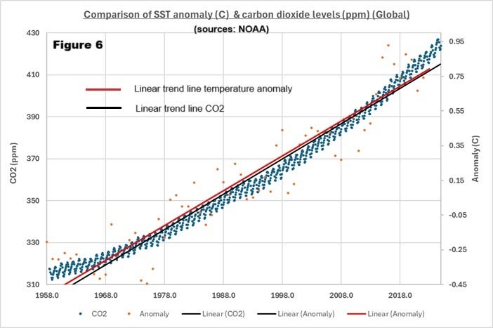
By aligning the two axis and performing a best straight line (linear) for both sets of data over the period of measurement at Mauna Loa they track one another virtually exactly i.e. the red and black lines are parallel.
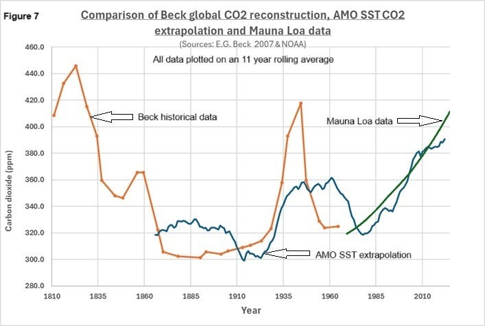
Using this linear correlation, we can extrapolate past levels of CO2 based on SST, compare it with historical measurements identified in a paper (2007) by E.G.Beck (1) and the Manua Loa data to see if there is feasible alignment between these three independent data sets (Fig 7):
If we use global SST as opposed to AMO SST to reconstruct the CO2 levels, we obtain the following (Fig 8):
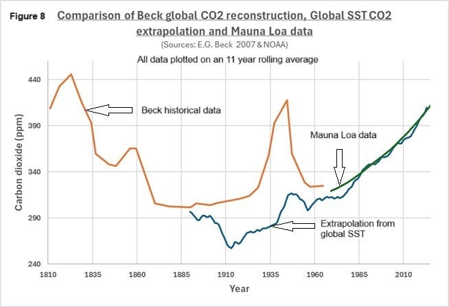
Both Figures 7 & 8 that use three independent methods of determination, fit together in a feasible manner and project a very different view than offered by the extended Keeling curve (Fig 3).
In a later paper (5) Beck made estimations of CO2 at the marine boundary layer. This estimation introduced a significant degree of uncertainty but here is that direct comparison (Fig 9) as performed above (Fig’s 7 & 8):
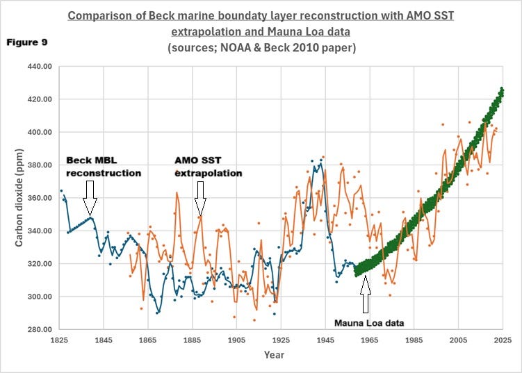
Why was the historical CO2 data identified in the Beck paper(s) ignored as many of the methods of analysis had +/- 3% accuracy or better? According to Beck the criteria for excluding the data was the lack of diurnal and annual cycling within the datasets and so the sampling locations must have considerable contamination masking these known phenomena and therefore it was inherently unreliable. There is a plausible explanation for this increased variability for inland locations provided later in this article. An interesting article outlining the difficulty Beck had in getting his work published is provided in the reference section (6).
Is there any further evidence supportive of the dominant control of CO2 by the oceans?
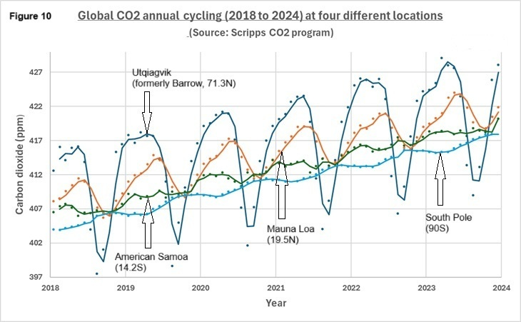
The Keeling curve as well as depicting a steady rise in carbon dioxide levels demonstrates an annual cycling which is explained by the difference in landmass between the Northern and Southern Hemispheres and consequent absorption of carbon dioxide by vegetation in the summer months and release through respiration / decay during the winter months. Here is a plot of that annual cycling at four different latitudes (Fig 10):
As a solitary explanation this is flawed. It is widely accepted that the oceans absorb vast quantities of carbon dioxide which is temperature and therefore seasonally dependent so why could this not be the main reason as opposed to plant growth? Could it be that if the temperature of the oceans is the primary control factor for the rise in carbon dioxide, then this would be entirely unacceptable with respect to the anthropogenic climate change narrative?
The plant growth theory does not adequately explain the steady change in amplitude at different locations. If we compare the South Pole (Fig 9 - blue line, 90S) with Utqiagvik (formerly Barrow) (Fig 9 - dark blue, 70.2N) the amplitudes are 2.4 and 15.4 ppm respectively. If we examine further the cycling amplitude at different latitudes, we get the following plot (Fig 11):
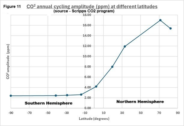
There is a very distinct difference between the two hemispheres that is a not a very good fit for NOAA’s plant growth explanation for the annual cycling affect. Is there a more feasible explanation?
Here is a plot that demonstrates the dramatic differences between relative land mass (equator is equal to 1) over the range 60N to 60S (Fig 12):
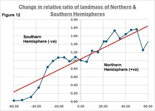
How could this change in landmass explain the above annual cycling? The maximal heating is at the equator which is readily absorbed by the oceans due to their considerable heat capacity and translucence. As they warm, they release carbon dioxide into the atmosphere which is then circulated towards both poles.
Here is a depiction of the annual temperature difference as we move away from the equator using satellite data (Fig 13):
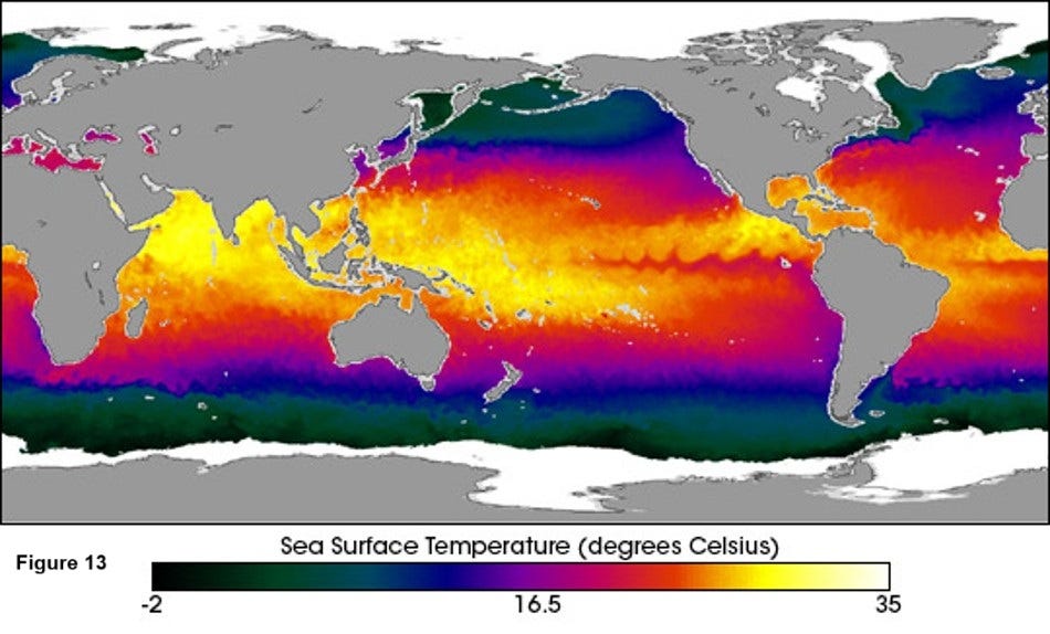
As there is much greater ocean area in the Southern Hemisphere CO2 released during seasonal warming readily equilibrates with the ocean as it moves towards the colder and more absorbent waters of the South Pole. Whilst in the Northern Hemisphere the increasing land mass restricts this equilibrium process and gives rise to an accumulation of CO2 and a greater amplitude of cycling. This process reverses as we go from the winter to summer in the respective hemispheres and is magnified by the changing ratio of land mass to ocean as we move from North to South. This gives rise to the differences in amplitude of annual cycling at different latitudes seen above (Fig 11). This is why the CO2 peak occurs in the Southern Hemisphere winter months and the dip in the summer months and why the shape of the curve in the Northern Hemisphere is skewed (see Figure 9 above).
For this explanation to be feasible we need to see SST’s that are seasonally responsive and demonstrate corresponding cycles to that seen for CO2. Using the Atlantic Multidecadal SST data we can plot the seasonal / cyclical response of this huge area of the ocean. Here is the graph for the entire dataset (Fig 14):
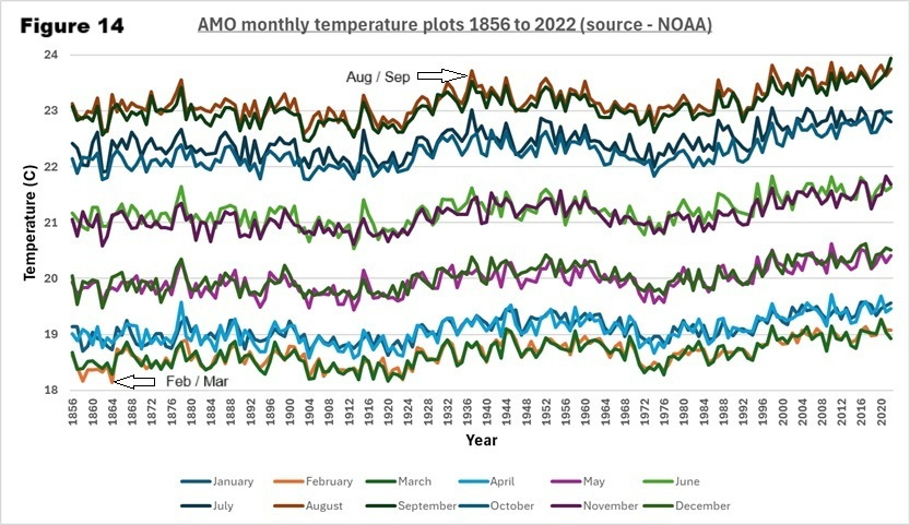
We can see that SST is highly seasonal with a slight lag phase from the yearly heating solar maximum. The months demonstrate close pairing with February and March as the coldest and August and September the warmest with a difference of about 5C.
The Scripps CO2 program only provides data from the following locations (Fig 15):
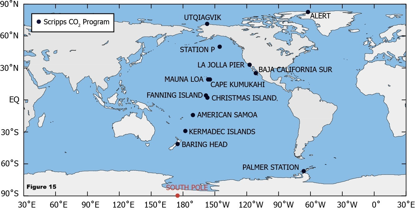
I presume that these sampling sites were selected based on the consistency of measurement on the grounds that there was minimal contamination / variability from vegetation and human activity. In many ways this was a flawed approach as it would reduce the land accumulation of CO2 proposed in the alternative cycling explanation.
However, NOAA, who are the primary drivers of the CO2 monitoring initiative, also generate data globally and this includes locations with significant surrounding landmass. If the second explanation is a dominant factor in the annual cycling, then we should see a significant increase in amplitude / seasonal accumulation of CO2 for sampling sites that have a significant surrounding landmass. As well as selection based on surrounding landmass, I sought comparable methods of sampling (7) and analysis (flask analysis) to the Scripps datasets previously cited. The Scripps data and NOAA data use validated calibration procedures so are comparable. I found four locations that met the above criteria and plotted the cycling amplitude against the Scripps locations (Fig 16):
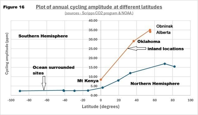
We can observe a significant and consistent differences between inland and ocean surrounded locations as predicted by the alternative cycling explanation.
If we examine two sites at similar Northern hemisphere latitudes (approximately 37N), we can assess of which of the possible explanations of annual cycling best fits the data (Figs 17 & 18):
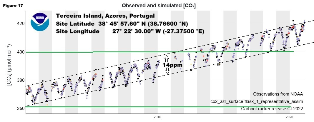
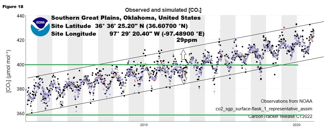
The key takeaways from a comparison of the above graphs, taken directly from the NOAA site, are the variation in amplitude and scatter in the datasets (please note the differences in the CO2 axis and the black dots are actual measurements). More importantly, I have drawn green lines at the CO2 minimums for both sets of data and they match one another closely, whist the peaks are accentuated for the inland (Oklahoma) data series. If the vegetation theory is correct, we would expect to see the reverse of this as the CO2 dips would be more accentuated inland than ocean zones during the peaks of growth / photosynthesis and consequent CO2 uptake. This data fits well with the concept that the peaks are being driven by variable atmospheric circulation and accumulation over land.
Are there further datasets supporting this alternative explanation? There are in the form of carbon isotope measurements. These determinations measure the change in ratio (δ13C) of two isotopes of carbon 13 (13C) and carbon 12 (12C). This δ13C has been measured at several sites for a significant period as it is claimed that the change in ratio is a measure of the burning of fossil fuels. NOAA’s explanation of this is in italics below:
The relative proportion of 13C in our atmosphere is steadily decreasing over time. Before the industrial revolution, δ13C of our atmosphere was approximately -6.5‰; now the value is around -8‰. Recall that plants have less 13C relative to the atmosphere (and therefore have a more negative δ13C value of around -25‰). Most fossil fuels, like oil and coal, which are ancient plant and animal material, have the same δ13C isotopic fingerprint as other plants. The annual trend–the overall decrease in atmospheric δ13C–is explained by the addition of carbon dioxide to the atmosphere that must come from the terrestrial biosphere and/or fossil fuels. In fact, we know from Δ14C measurements, inventories, and other sources, that this decrease is from fossil fuel emissions, and is an example of the Suess Effect.
When plants take up carbon dioxide, they prefer 12C over 13C. This leaves relatively more 13C in the atmosphere, which increases the δ13C of the atmosphere. However, in the winter, when the plants release more carbon dioxide than they consume, this carbon dioxide entering the atmosphere is relatively poor in 13C. This decreases the δ13C of the atmosphere during the fall and winter of each year since the carbon dioxide released from the plants is relatively rich in 12C–decreasing the ratio of 13C to 12C in the atmosphere. Of course, the seasons are opposite in the Northern and Southern Hemispheres, so why don't the trends in the two hemispheres cancel each other out? The answer is as easy as looking at a globe. There's a lot more land and a lot more land biota in the Northern Hemisphere, so on average across the globe, the δ13C and CO2 change with the Northern Hemisphere seasons.
The alternative theory proposed in this article is that carbon dioxide from the burning of fossil fuels is rapidly absorbed by the oceans and then released due to natural and seasonal changes in SST in addition the lighter C12 will be transported by atmospheric currents more readily. If this is the case, then this δ13C does indeed indicate an increase in anthropogenic emissions, but this does not override the dominant control of the oceans. Like the Keeling curve this δ13C data can paint a very different picture than the accepted narrative. Below is a plot of the rate of amplitude of annual cycling for CO2 and δ13C at different latitudes (Fig 19):
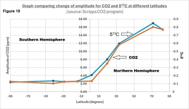
We can see that the δ13C and CO2 amplitudes match closely as we move from North to South. The distinct differences between the Northern and Southern Hemispheres fits well with the fact that the SST are a dominant factor in controlling both these independent parameters as explained above. Furthermore, we can see the distribution of heat and consequent release of CO2 away from the equator if we examine how these datasets vary during the recent global warming period. Here is a graph depicting the ratio of linear rate of change of δ13C and CO2 at different latitudes (Fig 20):
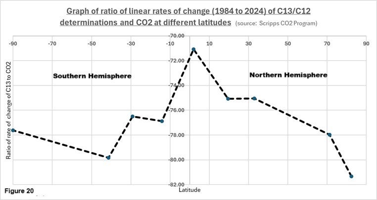
Figure 20 shows a distinct change in this ratio as we move away from the equator (0 degrees latitude) that aligns with the concept of the increased distribution of the lighter isotope (12C) with the increase in SST’s during this period (1984 to 2024).
As well as the colossal efforts made by climate scientists around the world described already, there is also data on sea surface flux. This is a measure of the of the absorption and release of carbon dioxide by the oceans and has been measured at different latitudes. If the oceans have a profound influence on the level of carbon dioxide in the atmosphere and this is reflected in the rate of change of cycling amplitude as this is also temperature related, then they should track one another. This is a graph making that comparison (Fig 21):
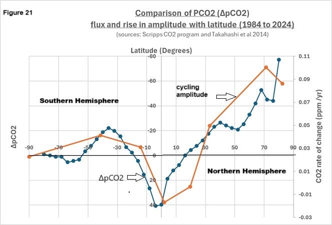
Both these independent sets of measurement track one another closely further supporting the alternative concepts of the dominant role of SST in controlling atmospheric CO2.
Another paper (8) on a similar theme represents the sea surface interaction at what they term the marine boundary layer which is also further supportive of the accumulation of CO2 over land and then this interacts with the sea surface at the coastal regions. Here is a global map from the respective paper illustrating the marine boundary temperature flux over a four year global warming period on a monthly and annual basis (Figs 22 & 23):
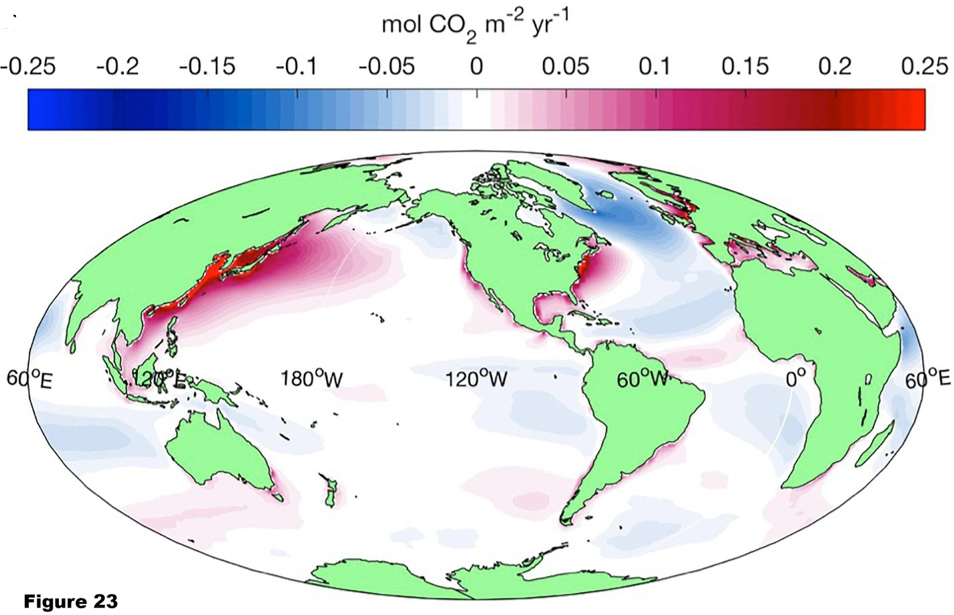
We can readily see the intensity of interaction of carbon dioxide at significant landmasses such as Asia and North America with the oceans. Clearly prevailing atmospheric currents will have a strong bearing on this interaction. For instance, the impact of the North Westerly winds across North America can be seen clearly.
A consistent pattern of independent data has been provided that align with an alternative explanation to the accepted narrative. The temperature of the oceans is a dominant factor in the control of the level of carbon dioxide in the atmosphere. So, what would the SST predict for future CO2 levels? This is the plot of AMO (Fig 24) and global SST (Fig 25):
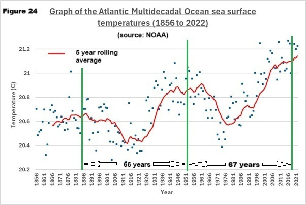
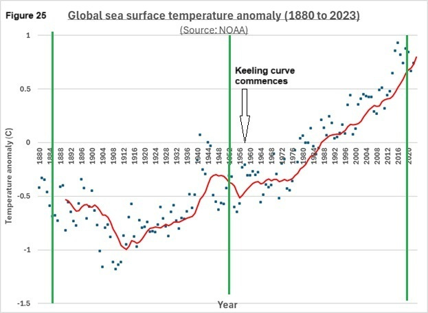
From Figure 24 for the AMO (11 year rolling average) we can see that there is evidence of cycling whilst in Figure 25 for the global picture it is far less apparent. It is probable that the Southern and Northern hemispheres have a cancelling effect. From figure 25 we can also see that during the Keeling curve measurement period (1958 to current) we have seen consistent SST warming. If these cycles are regular, then it would appear we are approaching a peak, and we should see SST diminish and CO2 levels follow by 2030.
The overall implications for the established climate change narrative are radical since the incessant recent rise of CO2 will cease? Will the narrative collapse?
Further discussion
The data in this article provide evidence that the temperature of the oceans is a dominant factor in the control of carbon dioxide. As well as temperature, marine organisms (phytoplankton) have an enormous capacity to sequester CO2. This is also related to seasonal temperatures and is almost certainly a huge influence in the control processes outlined in this article.
References and links:
Tom Nelson Podcast link:
(1) Beck Article on historical CO2 analysis (E.G.Beck): CO2_chemical.pdf
(2) Further analysis of data from Berkeley Earth clearly indicates that climate change in the period 1860 to 2020 is driven by the sun: https://open.substack.com/pub/sandrews/p/further-analysis-of-data-from-berkeley?r=16e1vo&utm_campaign=post&utm_medium=web
(3) Henrik Svensmark (Nir Shaviv) cosmic ray theory:
(4) Explanation of selection of statistical basis of evaluating evidence of a solar signal (see18.35 to 24.50):
(5) Reconstruction of Atmospheric CO2 Background Levels since 1826 from Direct Measurements near Ground (E.G.Beck):
Beck-2010-Reconstruction-of-Atmospheric-CO2.pdf
(6) Publication of Ernst-Georg Beck´s Atmospheric CO2 Time series from 1826-1960 (Harald Yndestad):
Microsoft Word - Yndestad 2022 Publication of Bek's CO2 series.docx
(7) Explanation by Ralph Keeling of flask sampling procedure:
(8) A Surface Ocean CO2 Reference Network, SOCONET and Associated Marine Boundary Layer CO2 Measurements:
Sea surface measurements of CO2 Frontiers paper.pdf
Links for data sources:
CO2 data: Scripps CO2 Program
NOAA CO2 data:
I did not answer your question. From the cosmic ray theory of Nir Shaviv & Henrik Svensmark it is implicit that the variation in the solar and the earth's magnetic fields deflect or increase cosmic rays striking the atmosphere. Interaction causes cloud condensation nuclei which results in more clouds and a net cooling effect therefore it has a significant bearing on global temperatures.
A belated comment to further debunk the man-made CO2 global warming hoax.
The Keeling Curve graph of atmospheric CO2 concentration is often portrayed as a proxy for relentless man-made global warming, see https://keelingcurve.ucsd.edu/. The full record runs from 1960 and shows a total increase from 1960 (315) to 2024 (420) of approximately 33%.
A graph of annual global man-made CO2 emissions running from 1940 is given by Statistica, see https://www.statista.com/statistics/276629/global-co2-emissions/. It shows an increase from 1960 (9.39) to 2024 (37.4) of approximately 300%.
This shows that the Keeling Curve is a poor proxy for alleged man-made global warming as the increase in atmospheric CO2 over the 1960 to 2024 time period is only about 11% of the increase in man-made CO2 emissions over the same period.