We are all doomed!!
We are all doomed!! - The climate change narrative?
We are all doomed!!
Highlights of this article
· Ice core data indicating flaws in the climate change accepted narrative.
· The insanity of nett zero.
· How data presentation can be deceptive.
During the pandemic significant misinformation was spread by trusted components of our societies including governments, main stream media (MSM) and scientific journals. An inevitable casualty of this misinformation was the climate change narrative. The analogies with the pandemic are obvious; the shutting down of debate, the science is settled, the absence of alternative views, the reliance on modelling etc. For many scepticism and paranoia rule. This article poses a series of questions to the climate change scientists as opposed to a definitive counter view. The golden rule I will apply is that I will only submit empirically founded observations. Fitting that criteria are ice core measurements that enable us to measure the past relationship between temperature and carbon dioxide (CO2). Ice cores provide a series of annual layers that can be dated accurately, and the available depth allows us to go back significantly in time. What are potential draw backs of using ice core data? Atmospheric CO2 will mix more rapidly whereas localised temperature could be influenced by other factors such as ocean currents and local geothermal activity. However, a consistent picture over a significant time scale should overcome these factors and at least provide us with a more reliable picture. To that end I have attempted to find the ice core data and articles that correlate CO2 and temperature. For some reason this seems difficult to obtain using a simple search. When I find this absence of information my covid induced paranoia alarm bell rings. What you will readily find is the following graph (Fig 1):
This graph reflects the title of this article; we are all doomed. The correlation between CO2 and temperature is obvious and the recent rapid rise (blue line at time zero / present) is totally alarming if CO2 is responsible. But is it? This chart is somewhat deceptive as the time scale is massive. I have added some vertical lines to assist a more detailed assessment. From these vertical lines we can see that temperature appears to peak prior to CO2. Let us examine this data more closely. I have managed to source raw data from the Vostok station Antarctica for the last 420,000 years (1) (Fig 2). This location has recorded one of the coldest temperatures on the planet (-89.2C) and is an elevated region of Antarctica:
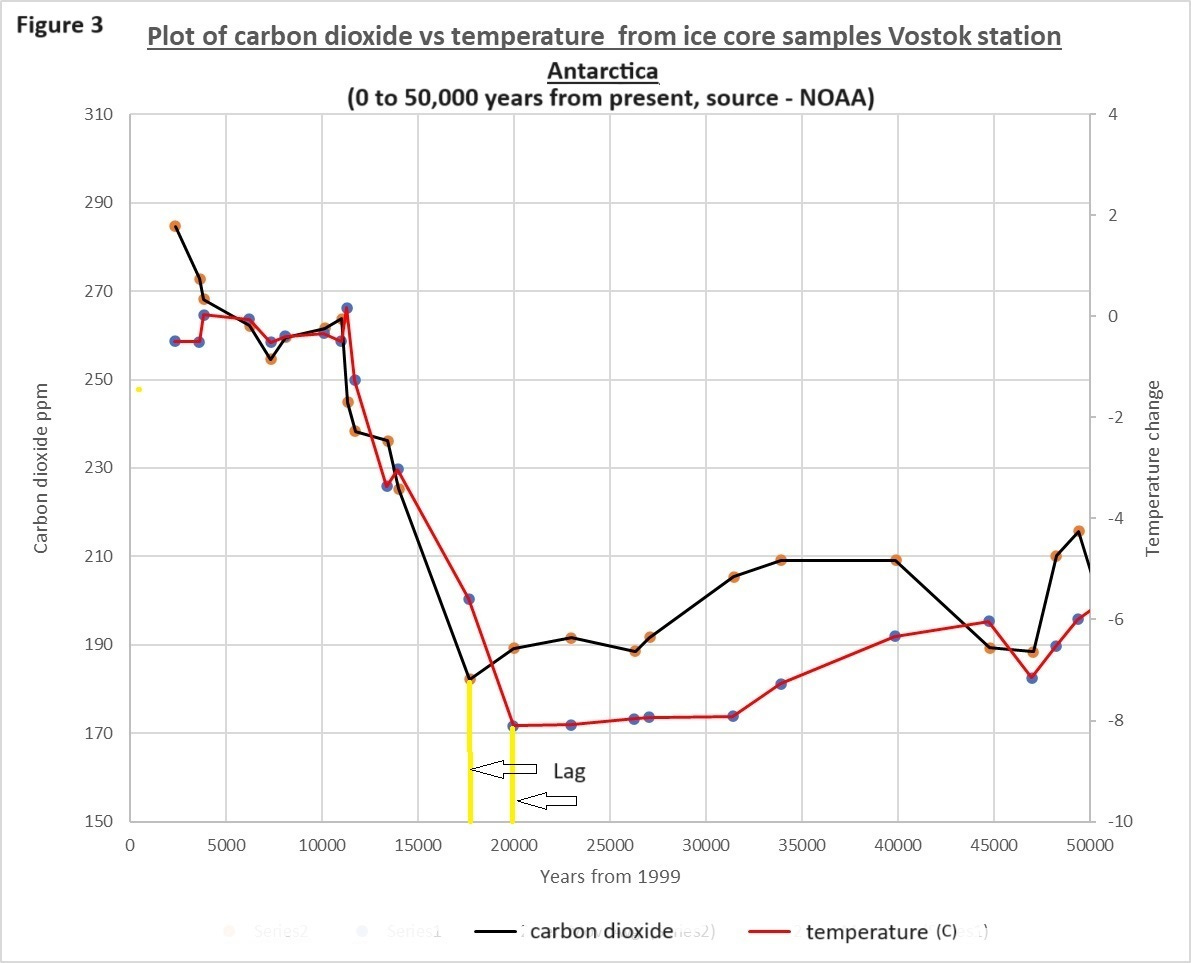
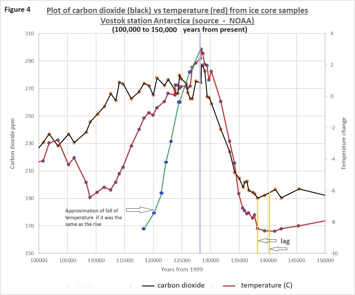
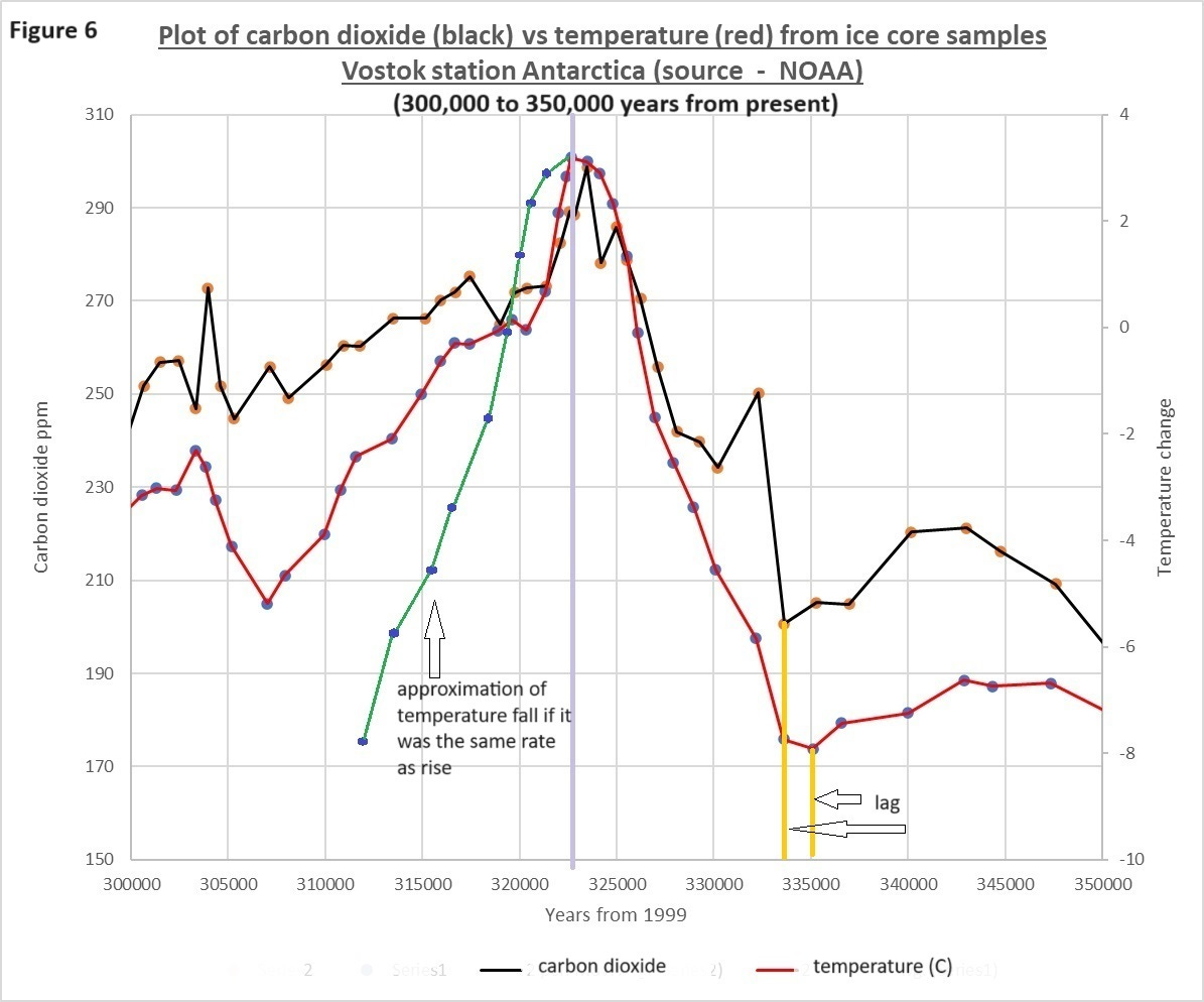
This data shows a clear relationship between CO2 and temperature but if examine the periods for the three major peaks and the most recent period more closely (Figs 3,4,5 & 6):
We can now readily see that CO2 increases after the temperature rise (yellow lines). In addition, temperature declines far more rapidly than CO2 and both parameters diminish less rapidly than they increased (see green theoretical line for temperature). These observations are consistent across all three of these major peaks for this period.
The estimates for the lag of CO2 increase are as follows:
The question is if CO2 is a major driver of temperature why does it lag the rise in temperature? Is it too simplistic to state that as the ocean’s warm dissolved CO2 is released into the atmosphere hence the correlation? This is not a new conundrum and climate scientists acknowledge this. The narrative aligned explanation is that the initial temperature rise is driven by the solar cycles which peak approximately every 100,000 years but this is then accelerated by an increase in CO2. As the CO2 is from a limited source the impact is restricted hence the maximum of the three peaks are all pretty much at the same level (280 to 300ppm). On this basis we should all fear the consequences of the sudden anthropogenic rise in CO2. This explanation does not account for the departure of the rate of decline of these two parameters. Another observation is that in all three instances the CO2 initially decline at approximately the same rate as the temperature but then the curves depart significantly (270ppm).
The fact that the solar cycles are driving these temperature changes is not really disputed. The concept of global warming is based on retaining the heat from the sun so this is an entirely rational standpoint. The theory of climate change is that CO2 acts as a primary forcing influence and feedback from increased water vapour and other greenhouse gases further accelerates this process.
The Vostok station ice core graphs above indicate just how long it takes for carbon dioxide in the atmosphere to diminish. Taking the average rate of decline of the three peaks, returning CO2 levels to preindustrial levels (280ppm) would take at best 64,000 years and this is also assuming an instant reduction to zero global emissions. So, to think that mankind can reduce emissions on a global scale and have a significant impact is farcical and we are all doomed. Perhaps carbon capture will save the day?
Another Vostok data set that seems to have been buried is a 280 year temperature reconstruction. This was based on snow / ice sample from 15 sites within 5km of the Vostok station. This 2014 paper (2) where this data is presented is focused primarily on the factors that influence the climate in this extreme part of planet. This is a useful exercise in providing perspective, but they make little or no comment or analysis on the underlying trends in the data. Here is a plot of that data (Fig 7):
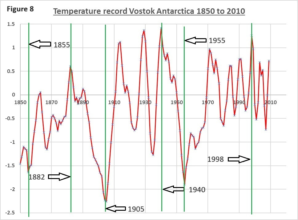
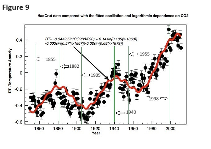
How does the Vostok data compare with global temperature records? I have taken some of the major peaks and troughs and added lines for reference (Figs 8 & 9). The global data has been taken from the work of Clive Best (3) and is based on the HadCrut data. There is a reasonable comparison when we compare the black dots for the global temperature and the peaks and troughs from the Vostok data. Please note the red line for the HadCrut plot is based on a theoretical fit and for the purposes of this comparison should be ignored.
The polynomial trend line (Fig 7 blue line) is indicating a warming of about 1 degree over the last 200 years and minimal warming since 1970. This record also demonstrates relatively rapid changes in temperature. For instance, from 1905 to 1914 this region saw a 3C warming. At the other end of the planet (Greenland) we have seen a similar rapid change that are a mere blink of the eye in terms of climate history. This illustrates just how deceptive time scales can be. On this basis this data does not indicate any alarming trends in temperature following the rapid industrial revolution driven rise in CO2.
The other factor that seems to go unaddressed is the real-world relationship between CO2and temperature. It is widely accepted that the physics of CO2 driven climate change are sound and that the temperature / CO2 relationship is logarithmic but what shape of curve fits the real-world data? Below is a graph demonstrating a theoretical logarithmic relationship (Fig 10):
I have added a second hypothetical curve (purple) and the respective temperature changes following a doubling of CO2 from current levels to illustrate the point of just how influential the real-world curve could be. Because of this logarithmic relationship the temperature impact of increasing CO2 diminishes significantly with concentration. This rationale explains why higher CO2 levels have had minimal impact relative to solar cycles as indicated by both sets of ice core data. There could be a degree of latency in the warming impact due to water vapour release from the oceans and the IPCC predictions are based on this feedback loop. Even this phenomenon is questioned by some scientists.
We are told that the Artic and Antarctica are the most sensitive regions to global warming? On this basis this analysis should be highly relevant.
Perhaps some “climate scientists” can address my questions? Why is this presentation of the data in this form not in the public domain? Is this data / reasoning flawed? Is the time scale irrelevant to the current sudden rapid increase in CO2? Is the Vostok data not comparable to the global picture? Is there a plausible explanation of this data that aligns with the current narrative?
Some scientists state that an increase in CO2 could benefit mankind with increased greening of the planet and mitigate against a forthcoming ice age.
It is unquestionable that our wealth, living standards, lifestyles and health are inextricably linked to energy supplied by fossil fuels. I think it is safe to say that we are addicted. The availability of fossil fuels will diminish. There are many reasons other than climate change why we should move to viable alternatives. The approximate energy supplied by fossil fuels globally is around 80%, electricity will never fill this gap. The fact that the weight to power density of battery stored electricity to fossil fuels is at best 7 to 1 is literally a weighty issue. Continuity from renewable sources is limited and storage capacity to fill any gap in supply is non-existent. We are nowhere near solving these issues and there are many more. The challenges that face mankind are significant but eventually we will have no choice.
In summary there are many questions that seem to be unanswered by the “accepted narrative”. The data presented in this article points towards a logarithmic relationship between the concentration of CO2 and warming of the planet that results in a minimal impact relative to solar cycles. To take a huge gamble on limited and ineffective measures such as wind and solar seems little more than a token political response primarily by the democracies of the West.
Appendix
Method of data analysis
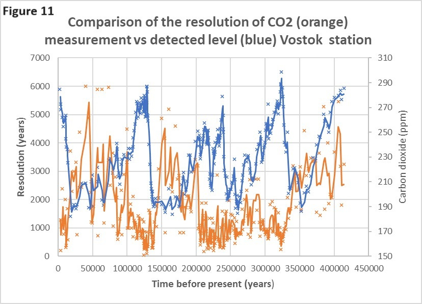
Both sets of data have been downloaded from the NOAA (text file) site directly into Excel. The 280 year record does not include CO2 as it can only be captured in the compressed ice after a certain age. There is limited information on the precise methodology used for the original analysis. It is reported that the timescales are determined accurately by conductivity although air bubbles can diffuse through the ice giving them the appearance of coming from an earlier period. The time resolution for the 420,000 year record of the temperature and CO2 data sets are different. The reason for this is presumably to provide consistency and therefore accuracy in the amount of CO2 analysed is adjusted by taking a longer ice core. For temperature measurements this is not an issue as it is determined on the relative amounts of oxygen isotopes in the ice itself. You can see this in the graph below (Fig 11) whereas the CO2 level reduces the resolution / length of ice core is increased. To make the temperature and CO2 datasets comparable I have aligned the two different time scales and then taken the mean temperature over the equivalent CO2 measurement period.
References:
1. Petit, J.R., et al., 1999. Climate and Atmospheric History of the Past 420,000 years from the Vostok Ice Core, Antarctica, Nature, 399, pp.429-436. Data downloaded from - ftp://ftp.ncdc.noaa.gov/pub/data/paleo/icecore/antarctica/vostok/co2nat.txt
2. Multiple climate shifts in the Southern Hemisphere over the past three centuries based on central Antarctic snow pits and core studies - Annals of Glaciology 2014-06-01
Recommended further reading:






Very interesting. I think it would be fascinating to get all the assorted datasets - without the ‘adjustments’ if possible - and then set ChatGPT 4 loose with the question “what do you find interesting or unusual about this data? I.e no priors in the analysis. I saw a YouTube with two techies doing this with data from the New York lottery and the use of unbiased prompts was very interesting. With a few days and some clean data the AI could write a series of valuable papers to add to the (lack of) discussion on the subject.
The other thing I would add is that, far from the Climate Industry copying the tactics of the lockdown SPI-B propagandists, it was the other way around! It’s just that the Green Industrial Complex has pushed its way to the front of the trough again.
"trusted components of our societies including governments, main stream media (MSM) and scientific journals." LOL. Only trusted by the dumb ones of society. Oh, yeah, the majority...