Climate change - perspective is not a dirty word (Part 2)
Climate change - perspective is not a dirty word (Part 2)
Highlights of this short article
· What do simple temperature measurements tell us about climate change?
· How the misleading portrayal of data can support the “accepted” climate narrative.
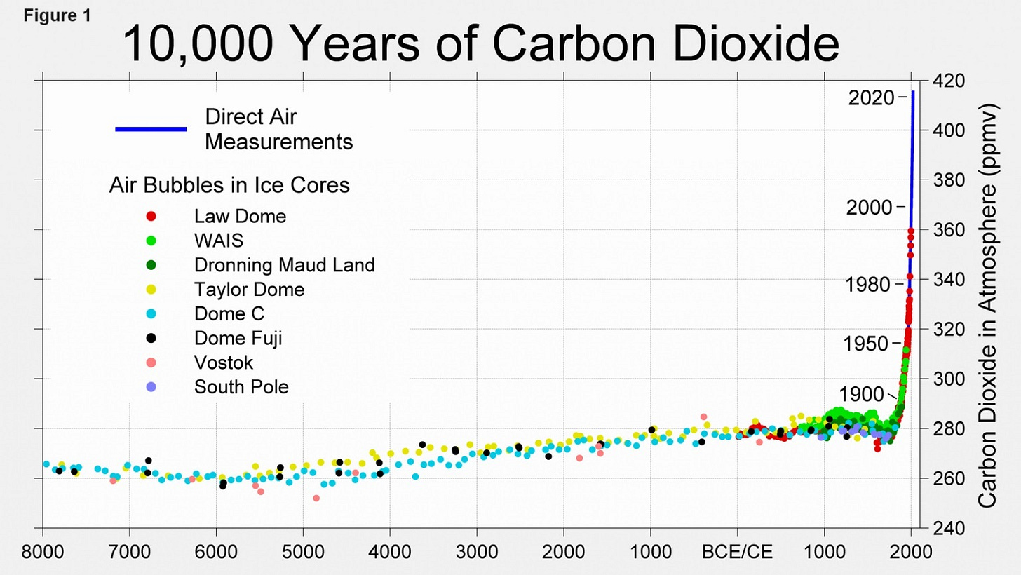
In a previous article (1) I tried to provide a better perspective on anthropogenic climate change using ice core data from Eastern Greenland. I now want to examine temperature measurements, taken directly from this climate sensitive region of our planet, to see if there are any alarming trends commensurate with the sudden rise in carbon dioxide (see Fig 1).
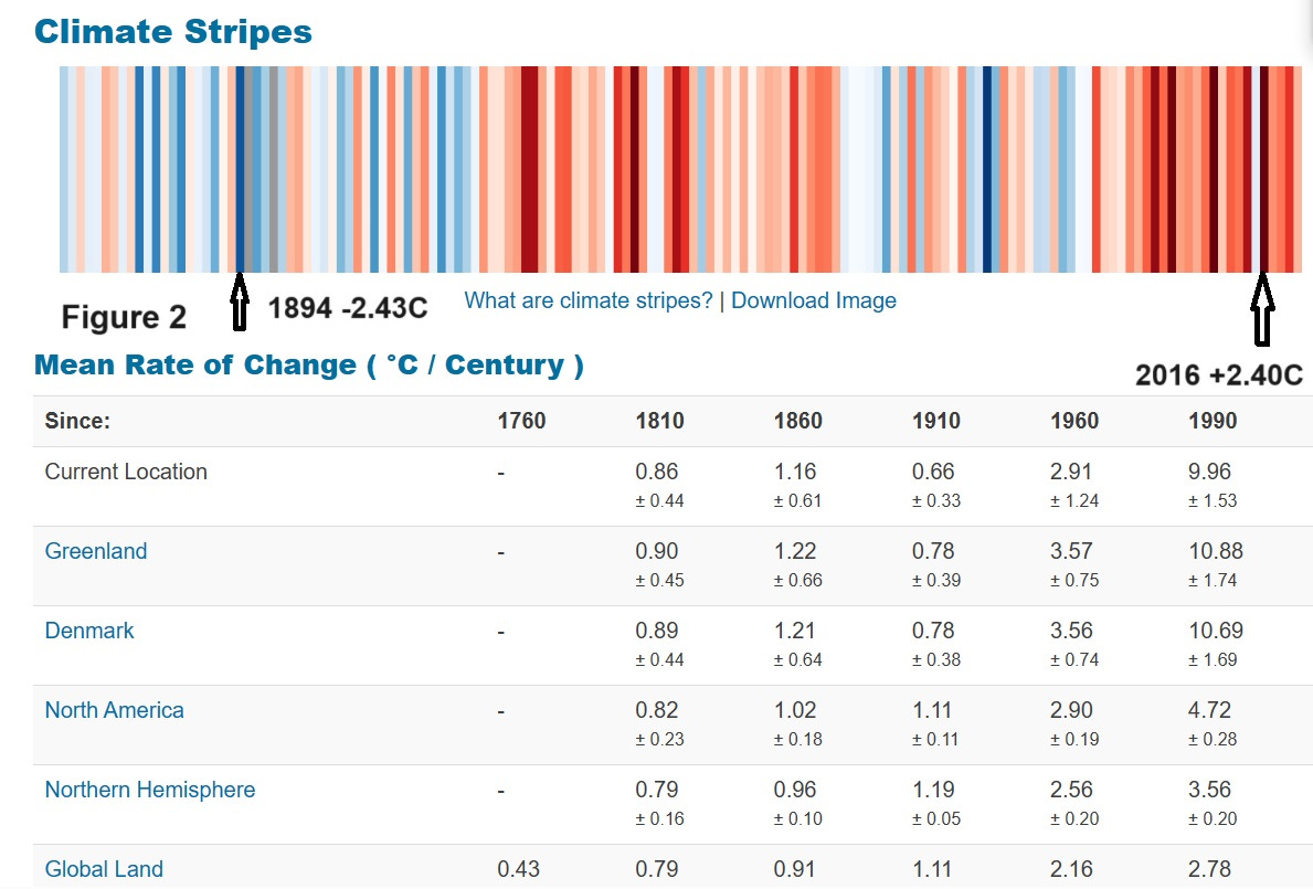
A site that holds extensive temperature records from many areas of the globe is Berkley Earth (2) whose data identifies Greenland as experiencing one of the dramatic rates of temperature rise on our planet (see Fig 2).
It is excellent that sites like Berkeley Earth provide us with data that enables us to perform an independent assessment, but their presentation of data is concerning. Berkely Earth states it has the following values:
OUR VALUES
We staunchly uphold the following organisational values:
Independence
Open-Source
Impartiality
Scientific Excellence
Berkely Earth presents data in the most alarming manner that it can invent. An example of this is shown in the following screenshot (Fig 2):
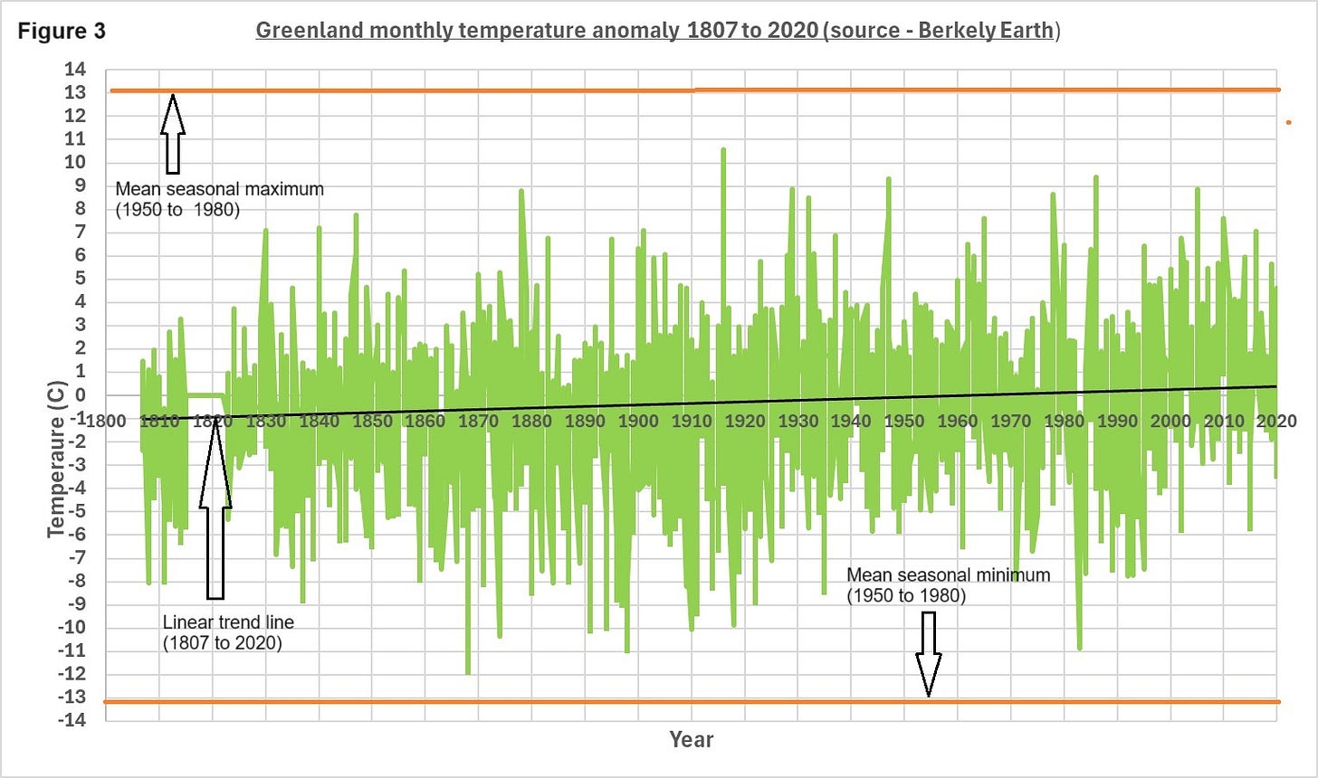
Whilst factually correct this is representation is quite misleading. The “climate stripes” show a concerning trend into the dark red. The acceleration of the mean rate of temperature change is also truly alarming. One of the “tricks" they use is to present annual temperature anomaly. The temperature anomaly is defined as the difference between the annual mean temperature from the average of 1950 to 1980. This means that they can conceal the monthly anomaly variation but more importantly the relativity to the actual seasonal temperature range. Presumably the justification for this approach is to enable a comparison of the impact of climate change on different global regions. To facilitate a better perspective, I have downloaded the raw data for this Greenland station (Fig 3) and presented it with the missing monthly anomaly data (green lines), added the linear trend in temperature (black line) and the seasonal average monthly maximum and minimum (orange lines).
If you take temperature anomalies from specific time points you will obtain steep rises but also sharp falls. For instance, 1983 saw one of the lowest temperature anomalies (-10.9 C) followed by one of the highest in 1986 (+9.4 C). This degree of variation is typical throughout this time series, but this equates to over 600C / century. Using their data directly, taking the 1960 to 2010 temperature rise, represents 4.3% of the average seasonal range. According to their own data this is one of the most impacted areas of the planet, so during half a century of significant increase in the levels carbon dioxide, we see a temperature rise less than one twentieth of the normal seasonal variation.
There appears to be little evidence of an abrupt “hockey stick” rise in temperature reflecting the rapid increase in carbon dioxide. Why do climate scientists not adopt this simple approach? Am I missing something? I will leave it to the reader to judge for themselves whether we should invest trillions on nett zero policies whose foundation seem to be at best shaky.
From my assessment of this site, I would like to amend Berkley Earth’s values:
OUR VALUES
We staunchly uphold a scare the pants of you narrative and are committed to the following:
Single minded approach
Deceptive portrayal of data
Biased
Unscientific and lacking perspective
I am dismayed at the levels of deception that make it very difficult not to go down paranoia driven conspiracy rabbit holes. A healthy scepticism backed by the most reliable data will hopefully prevail.
References:


Wow! What a different, and wonderful, and much more meaningful, perspective Figure 3 provides! Flora and fauna on earth have survived massive seasonal variations in local temperature for millions of years, and yet we are to be scared witless by the Green Blob into going communist and consenting to totalitarian rule to ensure "nicer weather" for the average global inhabitant 80 years from now. I am continually astonished by the fear mongering of "average global temperatures". Averages are fictitious numbers. There is not a single human being who is living, nor will any human ever be living, in the average global temperature. All "experienced" temperatures are local- the average is simply a mental concept and not real. If an "average" were real, an average human being would have half a penis, one ovary, and half a vagina. With some 30 different identified climates on earth, "average global temperature anomaly" obsession is just idiocy.
Great presentation. Let me also draw your attention to NOAA’s sea level data vs. CO2 ppm. Sea level measured by The Battery tide gauge NYC has been rising in a linear trend since 1850’s vs CO2 measured at Mona Loa Observatory is an X(squared) -X relationship and has zero correlation from 1950s as it rose from 315ppm to ~425ppm today.